A11y checklist in React
Please note that these examples are simplified snippets to demonstrate specific concepts. In real-world scenarios, you would integrate these concepts into your React components and application architecture based on your specific requirements.
The following takes the A11y Project Checklist (opens in a new tab) and applies it to React.
Content
Content is the most important part of your site.
Use plain language
Avoid figures of speech, idioms, and complicated metaphors.
Describe interactive elements
- Make sure that
button,a, andlabelelement content is unique and descriptive. - Use the
useId(opens in a new tab) hook to get a unique ID.
import { FC, useId } from 'react';

const MyButton: FC = () => {
  const emailId = useId();

  return (
    <>
      {/* Descriptive text "Click Me" that conveys the purpose or action associated with the button */}
      <button>Click Me</button>
      {/* Descriptive text "Learn More" that indicates the purpose or destination of the link */}
      <a href="/about">Learn More</a>
      {/* Label describing  */}
      <form>
        <label htmlFor={emailId}>Email:</label>
        <input type="email" id={emailId} />
      </form>
    </>
  );
};
Use correct language direction
Use left-aligned text for left-to-right (LTR) languages, and right-aligned text for right-to-left (RTL) languages.
Global code
Global code is code that affects your entire website or web app.
Validate your HTML
Use the Valid HTML (opens in a new tab) validator to provide a consistent, expected experience across all browsers and assistive technology.
lang attribute
Use a lang attribute on the html element. This helps assistive technology such as screen readers to pronounce content correctly.
const App = () => <html lang="en">{/* Your app content here */}</html>;Unique page titles
Provide a unique title for each page or view, as it is often the first piece of information announced by assistive technology. Ensure proper page titles using react-helmet (opens in a new tab).
import React from 'react';
import { Helmet } from 'react-helmet';

const MyComponent: React.FC = () => (
  <>
    <Helmet>
      <title>My Page Title</title>
      <meta name="description" content="This is the description of my page" />
    </Helmet>
    {/* Your component's JSX */}
  </>
);
Use the <Head /> component for
Next.js (opens in a new tab).
Viewport Zoom
Some people need to increase the size of text to a point where they can read it. Do not stop them from doing this, even for web apps with a native app-like experience.
- Don't set custom attribute to
user-scalable="no" - Remove the
user-scalable="no"parameter from the content attribute of the<meta name="viewport">element if it's been added element
<!-- Bad 👎 -->
<meta name="viewport" content="width=device-width, user-scalable=no" />
Landmark Elements
Use landmark elements to indicate important content regions.
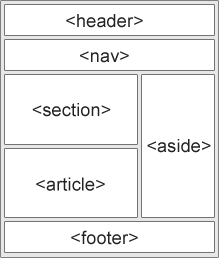
Use semantic HTML elements like <h1>, <nav>, <main>, <section>, etc., to provide clear structure and meaning to your content. Understand the fundamentals:
Linear Content Flow
Ensure a linear content flow.
- Remove
tabIndexattribute values that aren't either0or-1. - Do not add
tabIndexto interactable elements (a,button).
Avoid autofocus
Additionally, autofocus can be problematic for people with motor control disabilities, or who are blind or who have low vision. Avoid using the autofocus attribute.
// Bad 👎
const MyForm = () => <input autoFocus />;
// Bad 👎
import React, { useEffect, useRef } from 'react';
const MyForm: React.FC = () => {
const inputRef = useRef<HTMLInputElement>(null);
useEffect(() => {
if (inputRef.current) {
inputRef.current.focus();
}
}, []);
return (
<form>
<input ref={inputRef} type="text" />
</form>
);
};Allow extending session timeouts
This task involves backend implementation and is not specific to React. You would typically handle session timeouts on the server-side and provide mechanisms for extending or adjusting session timeouts.
Remove the title attribute
-
The
titleattribute has numerous issues, and should not be used if the information provided is important for all people to access. -
Only use a
titleoniframes.
Keyboard
It is important that your interface and content can be operated and navigated by the use of a keyboard. Some people cannot use a mouse or may be using other assistive technologies that may not allow for hovering or precise clicking.
Visible Focus Style
Make sure there is a visible focus style for interactive elements that are navigated to via keyboard input.
import './styles.css';

const VisibleFocusStyleExample = () => (
  <button className="focusable-button">Click Me</button>
);.focusable-button:focus {
outline: 2px solid blue;
}Remove Invisible Focusable Elements
Remove the ability to focus on elements that are not presently meant to be discoverable. This includes things like inactive drop down menus, off screen navigations, or modals.
import './styles.css';

const RemoveInvisibleFocusableElementsExample = () => (
  <div>
    <button className="hidden-button">Button 1</button>
    <input type="text" className="hidden-input" />
    <a href="#" className="invisible-link">
      Link
    </a>
  </div>
);.hidden-button {
visibility: hidden;
}
.hidden-input {
display: none;
}
.invisible-link {
opacity: 0;
}Keyboard Focus Order
Check to see that keyboard focus order matches the visual layout.
Images
Images are a very common part of most websites. Help make sure they can be enjoyed by all.
Ensure img elements have an alt attribute
const ImgAltAttributeExample = () => (
  <img src="path/to/image.jpg" alt="A beautiful landscape" />
);
Use null alt attribute for decorative images
Decorative images do not communicate information that is required to understand the website's overall meaning. Make sure that decorative images use null (empty) alt attribute values.
const DecorativeImageExample = () => (
  <img src="path/to/decorative-image.jpg" alt={null} />
);
Include image text in alt description
If there is text in the image, make sure to add it to the alt tag.
const DecorativeImageExample = () => (
  <img
    src="path/to/image-with-text.jpg"
    alt="Logo of ABC Company - Providing innovative solutions"
  />
);
Provide a text alternative for charts, graphs, and maps
Make sure to convey what the chart/graph/map is communicating in the alt field.
const ComplexImageExample = () => (
  <img
    src="path/to/complex-image.jpg"
    alt="Flowchart depicting the sales process:
          - Start: Incoming leads
          - Step 1: Lead qualification
          - Step 2: Product demo
          - Step 3: Negotiation
          - Step 4: Closing the deal
          - End: Successful sale"
  />
);
Headings
Heading elements (h1, h2, h3, etc.) help break up the content of the page into related "chunks" of information. They are incredibly important for helping people who use assistive technology to understand the meaning of a page or view.
Use heading elements to introduce content
Use heading elements to introduce different sections or chunks of content on your page or view.
const HeadingExample = () => (
  <div>
    <h1>Welcome to Our Website</h1>
    <h2>About Us</h2>
    <p>...</p>
  </div>
);
Use only one h1 element per page or view
Ensure that each page or view has only one h1 element, as it represents the main heading of the page and holds the highest level of importance.
// Bad 👎
const BadHeadingExample = () => (
  <div>
    <h1>Welcome to Our Website</h1>
    <h1>About Us</h1>
    <p>...</p>
  </div>
);

// Good 👍
const GoodHeadingExample = () => (
  <div>
    <h1>Welcome to Our Website</h1>
    <h2>About Us</h2>
    <p>...</p>
  </div>
);
Heading elements should be written in a logical sequence
Ensure that heading elements are written in a logical sequence, where higher-level headings (e.g. h1) are followed by lower-level headings (e.g. h2, h3, etc.) in a hierarchical order.
// Bad 👎
const BadHeadingExample = () => (
  <div>
    <h2>About Us</h2>
    <h1>Welcome to Our Website</h1>
    <p>...</p>
  </div>
);

// Good 👍
const GoodHeadingExample = () => (
  <div>
    <h1>Welcome to Our Website</h1>
    <h2>About Us</h2>
    <p>...</p>
  </div>
);
Don't skip heading levels
Avoid skipping heading levels, as it can lead to confusion and make it harder for users to understand the organization and structure of the content.
// Bad 👎
const BadHeadingExample = () => (
  <div>
    <h1>Welcome to Our Website</h1>
    <h3>About Us</h3>
    <p>...</p>
  </div>
);

// Good 👍
const GoodHeadingExample = () => (
  <div>
    <h1>Welcome to Our Website</h1>
    <h2>About Us</h2>
    <p>...</p>
  </div>
);
Lists
Lists elements let people know a collection of items are related and if they are sequential, and how many items are present in the list grouping.
Use list elements (ol, ul, and dl elements) for list content
When presenting a collection of related items, use appropriate list elements to structure the content. The <ol>, <ul>, and <dl> elements are used to create ordered, unordered, and definition lists, respectively.
const ListExample = () => (
  <div>
    <h2>Ordered List Example</h2>
    <ol>
      <li>Item 1</li>
      <li>Item 2</li>
      <li>Item 3</li>
    </ol>

    <h2>Unordered List Example</h2>
    <ul>
      <li>Item A</li>
      <li>Item B</li>
      <li>Item C</li>
    </ul>

    <h2>Definition List Example</h2>
    <dl>
      <dt>Term 1</dt>
      <dd>Definition 1</dd>
      <dt>Term 2</dt>
      <dd>Definition 2</dd>
    </dl>
  </div>
);
Controls
Controls are interactive elements such as links and buttons that let a person navigate to a destination or perform an action.
Use the a element for links
In the bad example, a non-semantic <span> element is used as a clickable area instead of using the appropriate <a> element. The good example demonstrates the correct usage of the <a> element with a valid href attribute.
// Bad 👎
const BadLinkExample = () => (
  <p>
    Click <span onClick={handleClick}>here</span> to visit our website.
  </p>
);

// Good 👍
const GoodLinkExample = () => (
  <p>
    Click <a href="/about">here</a> to visit our website.
  </p>
);
Ensure that links are recognizable
Make sure that links are visually distinguishable from other text and provide clear visual cues that they are clickable.
- Don't only rely on colour.
- Underlines are also useful.
// Bad 👎
const BadLinkStyleExample = () => (
  <p>
    Visit our website <a href="/about">here</a> for more information.
  </p>
);

// Good 👍
const GoodLinkStyleExample = () => (
  <p>
    Visit our website{' '}
    <a href="/about" style={{ textDecoration: 'underline' }}>
      here
    </a>{' '}
    for more information.
  </p>
);
In the bad example, the link is not visually distinguished from the surrounding text, making it difficult for users to identify it as a clickable element. The good example demonstrates using CSS styles (in this case, underlining) to make the link visually distinct.
Ensure that controls have :focus states
Provide a visible focus state for interactive elements, such as links and buttons, to indicate to users when they have keyboard focus.
// Bad 👎
const BadFocusStyleExample = () => <button>Submit</button>;

// Good 👍
const GoodFocusStyleExample = () => (
  // In a real life example this would not be in an inline style
  <button style={{ outline: '2px solid blue' }}>Submit</button>
);
Use the button element for buttons
Use the <button> element when creating buttons for interactive actions.
// Bad 👎
const BadButtonExample = () => (
  <div>
    <span onClick={handleClick}>Submit</span>
  </div>
);

// Good 👍
const GoodButtonExample = () => (
  <div>
    <button onClick={handleClick} type="button">
      Submit
    </button>
  </div>
);
In the bad example, a non-semantic <span> element is used as a clickable area instead of using the appropriate <button> element. The good example demonstrates the correct usage of the <button> element.
Provide a skip link and make sure that it is visible when focused
Include a "skip link" at the beginning of your page to allow users to skip repetitive navigation and jump directly to the main content. Ensure that the skip link becomes visible and accessible when it receives focus.
// Bad 👎
const BadSkipLinkExample = () => (
  <div>
    <a href="#main-content">Skip to main content</a>
    {/* Rest of the page content */}
  </div>
);

// Good 👍
const GoodSkipLinkExample = () => (
  <div>
    <a
      href="#main-content"
      style={{
        position: 'absolute',
        left: '-10000px',
        top: 'auto',
        width: '1px',
        height: '1px',
        overflow: 'hidden',
      }}
    >
      Skip to main content
    </a>
    {/* Rest of the page content */}
    <main id="main-content">{/* Main content */}</main>
  </div>
);
In the bad example, the skip link is included in the markup but is visible to sighted users, cluttering the page visually. The good example shows the skip link positioned off-screen using CSS to make it invisible to sighted users, but still accessible to screen readers and keyboard users.
Identify links that open in a new tab or window
Indicate links that open in a new tab or window by adding an appropriate visual cue, such as an icon or text, to let users know the link behavior.
// Bad 👎
const BadNewTabLinkExample = () => (
  <a href="/external" target="_blank">
    Visit external website
  </a>
);

// Good 👍
const GoodNewTabLinkExample = () => (
  <a href="/external" target="_blank" rel="noopener noreferrer">
    Visit external website
    <span aria-hidden="true"> (opens in a new tab)</span>
    <span className="sr-only">(opens in a new tab)</span>
  </a>
);
In the bad example, a link that opens in a new tab is not visually distinguishable from regular links, potentially causing confusion for users. The good example demonstrates adding the text "(opens in a new tab)" visually and using a visually hidden class (sr-only) to provide the same information to screen reader users.
The noopener noreferrer value for the rel attribute in the example serves two purposes when opening a link in a new tab or window:
-
noopener: It prevents the newly opened window from having access to thewindow.openerproperty, which helps protect against certain security vulnerabilities. By settingnoopener, the new window cannot modify the window that opened it, preventing potential malicious actions. -
noreferrer: It prevents the referring URL from being sent as aRefererheader when the new window is opened. This enhances privacy by not revealing the source URL of the previous page to the linked website.
Including both noopener and noreferrer provides an extra layer of security and privacy when opening links in new tabs or windows. It's generally recommended to include these attributes when using target="_blank".
Tables
If you need to display data in rows and columns? Use the table element.
// Bad 👎
const BadTableExample = () => (
  <>
    <div>
      <div>Column 1</div>
      <div>Column 2</div>
      <div>Column 3</div>
    </div>
    <div>
      <div>Data 1</div>
      <div>Data 2</div>
      <div>Data 3</div>
    </div>
  </>
);

// Good 👍
const GoodTableExample = () => (
  <table>
    <thead>
      <tr>
        <th>Column 1</th>
        <th>Column 2</th>
        <th>Column 3</th>
      </tr>
    </thead>
    <tbody>
      <tr>
        <td>Data 1</td>
        <td>Data 2</td>
        <td>Data 3</td>
      </tr>
    </tbody>
  </table>
);
Use the correct table head elements
Use the thead element to wrap table heads and use the th element for table headers (with appropriate scope attributes).
// Bad 👎
const BadTableHeaderExample = () => (
  <table>
    <tr>
      <td>Column 1</td>
      <td>Column 2</td>
      <td>Column 3</td>
    </tr>
  </table>
);

// Good 👍
const GoodTableHeaderExample = () => (
  <table>
    <thead>
      <tr>
        <th scope="col">Column 1</th>
        <th scope="col">Column 2</th>
        <th scope="col">Column 3</th>
      </tr>
    <thead>
  </table>
);
Use the caption element
Use the caption element to provide a title for the table.
// Bad 👎
const BadTableCaptionExample = () => (
  <table>
    <tr>
      <th scope="col">Column 1</th>
      <th scope="col">Column 2</th>
      <th scope="col">Column 3</th>
    </tr>
    {/* Rest of table... */}
  </table>
);

// Good 👍
const GoodTableCaptionExample = () => (
  <table>
    <caption>Table Caption</caption>
    <thead>
      <tr>
        <th scope="col">Column 1</th>
        <th scope="col">Column 2</th>
        <th scope="col">Column 3</th>
      </tr>
    </thead>
    {/* Rest of table... */}
  </table>
);
Forms
Forms allow people to enter information into a site for processing and manipulation. This includes things like sending messages and placing orders.
Add corresponding label elements
All inputs in a form are associated with a corresponding label element.
Tip: Use the useId (opens in a new tab) hook to
create unique IDs in React.
// Bad 👎
const BadInputLabelExample = () => (
  <form>
    <input type="text" id="name" />
  </form>
);

// Good 👍
import { useId } from 'react';

const GoodInputLabelExample = () => {
  const emailId = useId();

  return (
    <form>
      <div>
        <label htmlFor={emailId}>Email</label>
        <input type="email" id={emailId} />
      </div>
    </form>
  );
};
Use fieldset and legend elements
- Use
fieldsetto group related form sections. - Use
legendto provide context for what the section is for.
// Bad 👎
const BadFieldsetLegendExample = () => (
  <form>
    <div>
      <label htmlFor="email">Email</label>
      <input type="email" id="email" />
    </div>
  </form>
);

// Good 👍
const GoodFieldsetLegendExample = () => (
  <form>
    <fieldset>
      <legend>Personal Information</legend>
      <div>
        <label htmlFor="firstName">First name</label>
        <input type="text" id="firstName" />
      </div>
      <div>
        <label htmlFor="lastName">Last name</label>
        <input type="text" id="lastName" />
      </div>
    </fieldset>
  </form>
);
Autocomplete where applicable
Inputs use autocomplete where appropriate.
// Bad 👎
const BadAutocompleteExample = () => (
  <form>
    <div>
      <label htmlFor="name">Name</label>
      <input type="text" id="name" />
    </div>
  </form>
);

// Good 👍
const GoodAutocompleteExample = () => (
  <form>
    <div>
      <label htmlFor="name">Name</label>
      <input type="text" id="name" autoComplete="name" />
    </div>
  </form>
);
Any input errors are displayed
- Make sure that form input errors are displayed in a list above the form after submission.
- Associate input error messaging with the input it corresponds to.
// Bad 👎
const BadFormErrorExample = () => (
  <form>
    <div>
      <label htmlFor="name">Name</label>
      <input type="text" id="name" />
    </div>
    <button type="submit">Submit</button>
  </form>
);

// Good 👍
const GoodFormErrorExample = () => (
  <form>
    <div>
      <label htmlFor="name">Name</label>
      <input type="text" id="name" />
    </div>
    <ul>
      <li>Error 1</li>
      <li>Error 2</li>
      <li>Error 3</li>
    </ul>
    <button type="submit">Submit</button>
  </form>
);

// Better ⭐️
const GoodErrorAssociationExample = () => (
  <form>
    <div>
      <label htmlFor="name">Name</label>
      <input type="text" id="name" />
      <span role="alert" aria-labelledby="name">
        Error message
      </span>
    </div>
    <button type="submit">Submit</button>
  </form>
);
Adequate communication
Make sure that error, warning, and success states are not visually communicated by just color.
// Bad 👎
const BadStateCommunicationExample = () => (
  <form>
    <div>
      <label htmlFor="name">Name</label>
      <input type="text" id="name" className="error" />
    </div>
    <button type="submit">Submit</button>
  </form>
);

// Good 👍
const GoodStateCommunicationExample = () => (
  <form>
    <div className="form-field error">
      <label htmlFor="name">Name</label>
      <input type="text" id="name" />
      <span role="alert" aria-labelledby="name">
        Error message
      </span>
    </div>
    <button type="submit">Submit</button>
  </form>
);
Media
Media includes content such as pre-recorded and live audio and video.
Don't autoplay
Make sure that media does not autoplay, this can be distracting and disruptive.
// Bad 👎
const BadMediaAutoplayExample = () => (
  <video src="video.mp4" autoplay controls></video>
);

// Good 👍
const GoodMediaAutoplayExample = () => <video src="video.mp4" controls></video>;
Ensure that media controls use appropriate markup
// Bad 👎
const BadMediaControlsExample = () => (
  <audio src="audio.mp3">
    <button>Play</button>
    <button>Pause</button>
  </audio>
);

// Good 👍
const GoodMediaControlsExample = () => <audio src="audio.mp3" controls></audio>;
Make sure space pauses media
Provide a global pause function on any media element. If the device has a keyboard, ensure that pressing the Space key can pause playback. Make sure you also don't interfere with the Space key's ability to scroll the page/view when not focusing on a form control.
Video
Confirm the presence of captions
Help people who can't hear the audio content of a video by using the <track> component to insert captions into a video.
// Bad 👎
const BadCaptionExample = () => <video src="video.mp4" controls></video>;

// Good 👍
const GoodCaptionExample = () => (
  <video src="video.mp4" controls>
    <track kind="captions" src="captions.vtt" label="English" default />
  </video>
);
Remove seizure triggers
Use the disablePictureInPicture prop to remove any seizure triggers.
// Bad 👎
const BadSeizureTriggerExample = () => <video src="video.mp4" controls></video>;

// Good 👍
const GoodSeizureTriggerExample = () => (
  <video src="video.mp4" controls disablePictureInPicture></video>
);
Audio
Confirm that transcripts are available
Help people who can't hear the audio content of a video by providing transcripts.
// Bad 👎
const BadTranscriptExample = () => <audio src="audio.mp3" controls></audio>;

// Good 👍
const GoodTranscriptExample = () => (
  <audio src="audio.mp3" controls>
    <track kind="captions" src="transcript.vtt" label="English" default />
  </audio>
);
Appearance
How your website app content looks in any given situation.
Check your content in specialized browsing modes
Activate modes such as High Contrast and make sure your icons, borders, links, form fields, and other content are still present and legible.
Ensure that text can be resized up to 200%
By ensuring that the website supports resizable text up to 400%, you allow users with visual impairments or those who prefer larger text sizes to comfortably read and interact with your content without loss of content or functionality.
const App = () => (
  <div className="App">
    <h1 style={{ fontSize: '2rem' }}>Resizable Text</h1>
    <p style={{ fontSize: '1.5rem' }}>
      This text can be resized up to 400% without loss of content or
      functionality.
    </p>
  </div>
);
Use relative font sizes and responsive design techniques:
To support resizable text, it's recommended to use relative font sizes instead of fixed pixel sizes. This allows the text to scale proportionally when users adjust their browser's font size settings. Additionally, utilizing responsive design techniques ensures that the layout and content adapt effectively to different screen sizes.
import './App.css';

const App = () => (
  <div className="App">
    <h1 className="heading">Resizable Text</h1>
    <p className="content">
      This text can be resized up to 400% without loss of content or
      functionality.
    </p>
  </div>
);.heading {
font-size: 2rem;
}
.content {
font-size: 1.5rem;
}
@media (max-width: 768px) {
.heading {
font-size: 1.5rem;
}
.content {
font-size: 1rem;
}
}Setting fixed dimensions that prevent text from resizing:
Setting text sizes in pixels (e.g., font-size: 16px;) restricts users from resizing the text using browser settings. Instead, it's recommended to use relative units such as percentages or ems, which allow users to scale the text according to their needs.
import './App.css';

const App = () => (
  <div className="App">
    <h1 className="heading">Resizable Text</h1>
    <p className="content">
      This text can be resized up to 400% without loss of content or
      functionality.
    </p>
  </div>
);.heading {
font-size: 2rem;
}
.content {
font-size: 1.5rem;
}Test the website's text resizing functionality at various magnification levels:
- Copy
chrome://settings/fontsto the address bar and then return on your keyboard. - Increase the font size to 32px (default is 16px).
- Ensure your web app works as expected.
Make sure color isn't the only way information is conveyed
Ensure that information is not conveyed solely through color, as some users may have difficulty perceiving color differences. Example:
// Bad 👎
const BadA11yComponent = () => <span style={{ color: 'red' }}>✘</span>;

// Good 👍
const GoodA11yComponent = () => (
  <span style={{ color: 'red' }} aria-label="Rejected">
    ✘
  </span>
);
Make sure instructions are not visual or audio-only
// Bad 👎
const BadInstructionsExample = () => (
  <div>
    <p>Click on the red button to submit the form</p>
    <button style={{ background: 'red' }}>Submit</button>
  </div>
);

// Good 👍
const GoodInstructionsExample = () => (
  <div>
    <p>Press the Enter key or use the Submit button to submit the form</p>
    <button style={{ background: 'red' }}>Submit</button>
  </div>
);
Use a simple, straightforward, and consistent layout
// Bad 👎
const BadLayoutExample = () => (
  <div>
    <div style={{ float: 'left' }}>Content 1</div>
    <div style={{ float: 'right' }}>Content 2</div>
    <div style={{ clear: 'both' }}></div>
  </div>
);

// Good 👍
const GoodLayoutExample = () => (
  <div>
    <div style={{ display: 'flex', justifyContent: 'space-between' }}>
      <div>Content 1</div>
      <div>Content 2</div>
    </div>
  </div>
);
Animation
Content that moves, either on its own, or when triggered by a person activating a control.
Ensure animations are subtle and do not flash too much
To avoid distractions and potential seizures, limit flashing to less than 3x per second.
Provide a mechanism to pause background video
// Bad 👎
const BadBackgroundVideoExample = () => (
  <div>
    <video src="video.mp4" autoPlay loop muted></video>
  </div>
);

// Good 👍
const GoodBackgroundVideoExample = () => (
  <div>
    <video src="video.mp4" autoPlay loop muted controls></video>
  </div>
);
Make sure all animation obeys the prefers-reduced-motion media query
Color contrast
Color contrast is how legible colors are when placed next to, and on top of each other.
Check the contrast for text and icons
// Bad 👎
const BadContrastExample = () => (
  <div>
    <p style={{ color: '#ff0000', backgroundColor: '#00ff00' }}>Hello World</p>
  </div>
);

// Good 👍
const GoodContrastExample = () => (
  <div>
    <p style={{ color: '#000000', backgroundColor: '#ffffff' }}>Hello World</p>
  </div>
);
Check the contrast of borders for input elements (text input, radio buttons, checkboxes, etc.)
// Bad 👎
const BadBorderContrastExample = () => (
  <div>
    <input type="text" style={{ borderColor: '#ff0000' }} />
  </div>
);

// Good 👍
const GoodBorderContrastExample = () => (
  <div>
    <input type="text" style={{ borderColor: '#000000' }} />
  </div>
);
Check text that overlaps images or video
Check custom ::selection colors
// Bad 👎
const BadSelectionColorExample = () => (
  <div>
    <style>
      {`
        ::selection {
          color: #ff0000;
          background-color: #00ff00;
        }
      `}
    </style>
    <p>Select this text</p>
  </div>
);

// Good 👍
const GoodSelectionColorExample = () => (
  <div>
    <style>
      {`
        ::selection {
          color: #000000;
          background-color: #ffffff;
        }
      `}
    </style>
    <p>Select this text</p>
  </div>
);
Mobile and touch
Things to check mobile experiences for.
Check that the site can be rotated to any orientation
The web site should allow for portrait and landscape mode.
Remove horizontal scrolling
// Bad 👎
const BadHorizontalScrollExample = () => (
  <div style={{ width: '1000px', overflowX: 'scroll' }}>
    <p>Content</p>
  </div>
);

// Good 👍
const GoodHorizontalScrollExample = () => (
  <div style={{ width: '100%', overflowX: 'hidden' }}>
    <p>Content</p>
  </div>
);
Ensure that button and link icons can be activated with ease
// Bad 👎
const BadIconActivationExample = () => (
  <div>
    <button>
      <span role="img" aria-label="Save">
        💾
      </span>
      Save
    </button>
  </div>
);

// Good 👍
const GoodIconActivationExample = () => (
  <div>
    <button>
      <span role="img" aria-hidden="true">
        💾
      </span>
      Save
    </button>
  </div>
);
Ensure sufficient space between interactive items in order to provide a scroll area
This helps people with motor control issues such as hand tremors.
// Bad 👎
const BadScrollAreaExample = () => (
  <div style={{ height: '200px', overflowY: 'scroll' }}>
    <button>Button 1</button>
    <button>Button 2</button>
    <button>Button 3</button>
    <button>Button 4</button>
    <button>Button 5</button>
  </div>
);

// Good 👍
const GoodScrollAreaExample = () => (
  <div style={{ height: '200px', overflowY: 'scroll' }}>
    <button style={{ marginBottom: '20px' }}>Button 1</button>
    <button style={{ marginBottom: '20px' }}>Button 2</button>
    <button style={{ marginBottom: '20px' }}>Button 3</button>
    <button style={{ marginBottom: '20px' }}>Button 4</button>
    <button>Button 5</button>
  </div>
);
Keep up to date with any latest changes or announcements by subscribing to the newsletter below.